Some suggestions for improvement of interaction with C4D interface :
Mouse icon color for warning
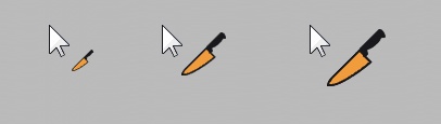
Use intuitively colored mouse cursor for warning against potentially destructive actions of some tools :
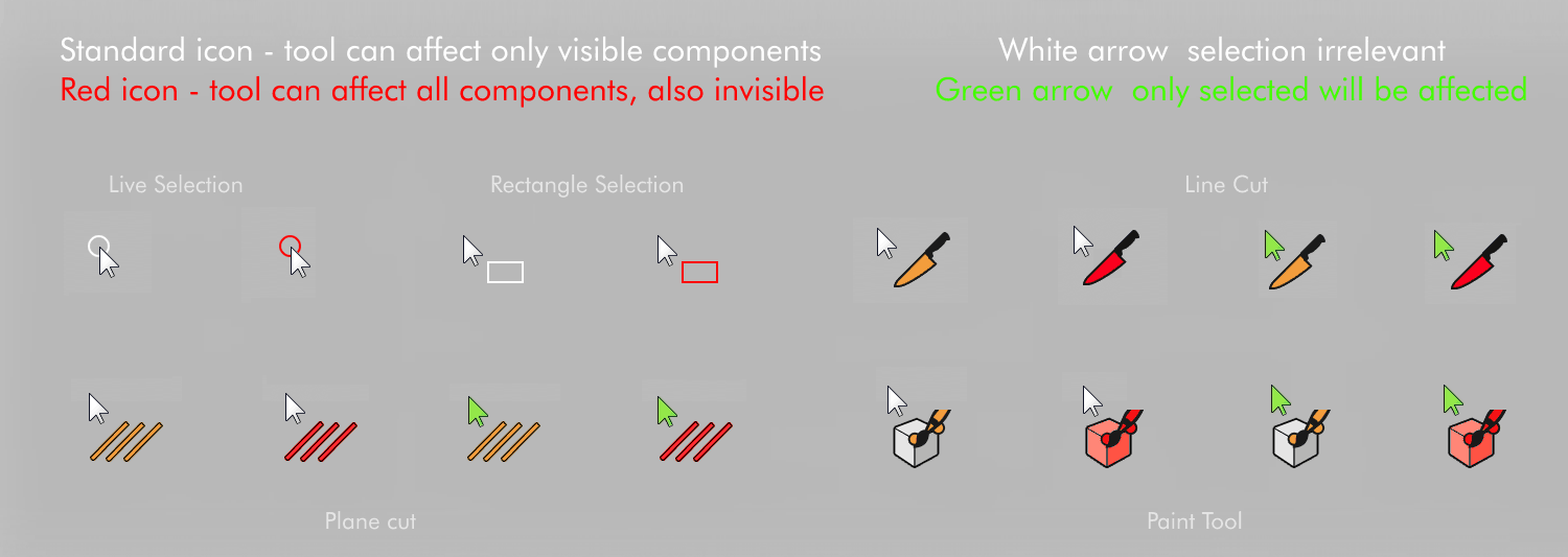
Problem : currently it often happens that selection tool selects invisible components, operations are performed on those components, while user is unaware. He might realize only after several hours of work, that his model was messed up. Same applies to cut tools, and paint tool. User should get clear warning that tool operates in a mode, that affects invisible components. The simplest way to warn user is to color tool icon displayed near mouse cursor on red. On the other hand, when tool is set to affect only selected components, mouse arrow could turn in green (green because it is rather safe : user has to select components first). Green arrow would help to avoid situations when let say cut operations are performed, but nothing is cut, because Knife was in "only selected" mode, while user cut through unselected polygons, thinking that the tool is in "all" mode.
Toggle commands for switching Visible/Selected states :
There should be toggle commands allowing to switch from keyboard between Visible Only / All and Selected Only / All states for all tools using such parameters. Now there is only the toggle for Visible Only / All, but it affects only Selection Tools, and not Cut or Paint Tools.
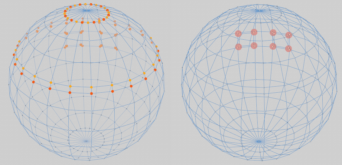
Display Tolerance Radius for Optimize Tool
Problem : Now, it is often difficult to properly define the tolerance radius for Optimize Tool, as there is no visual feedback. Often I had my models damaged, because Optimize Tool has welded points that should not be welded, and I haven't noticed it before it was too late (for undo). (eg. points have been at the opposite side of the object )
Solution : There should be an option in Optimize Tool, allowing to highlight points that will be merged, then user could apply the tool while in wireframe mode, and have a better awarenes what will be merged. Two colors could be used - one for points that will disappear in the process, second one for target points.
C4D could also provide a second option displaying the tolerance radius around points - radius could be displayed around only selected points, or if no selection, around the few closet points. (probably it should be not displayed around all points (it could slow down Viewport for very high poly objects)
Features mentioned above could also work for edges and polygons by highlighting edges or polygons that will be removed.
| MAIN PAGE |
|
Comment Form is loading comments...
|